
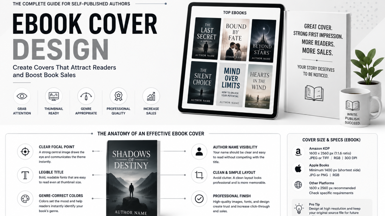
Your ebook cover has less than a second to convince a reader to stop scrolling. On Amazon, Apple Books, or any retail platform, that cover shows up as a small thumbnail next to dozens of competitors and readers judge genre, quality, and professionalism almost instantly, long before they read your blurb. Get the cover wrong, and even a brilliantly written book can sit unread. Get it right, and your cover becomes your single most effective (and cheapest) marketing asset.
This guide covers everything you need to know about ebook cover design what makes a cover actually work, the exact specs retailers require, your DIY vs. professional options with real costs, the best tools available, and the mistakes that quietly kill sales.
Quick Answer
Ebook cover design is the process of creating the front-cover image that represents a digital book on retail platforms like Amazon Kindle, Apple Books, and Kobo. A strong ebook cover matches genre conventions, stays readable at thumbnail size, and meets each platform’s technical specs (typically 1600 x 2560 pixels, JPEG format, RGB color mode for Amazon KDP).

Key requirements for Amazon KDP: 1600 x 2560 px recommended, minimum 1000 px on shortest side, JPEG or TIFF, under 50MB, RGB color mode, 300 DPI.

What Makes a Good Ebook Cover Design?
A good ebook cover isn’t about looking “nice.” It’s about communicating the right information to the right reader in under two seconds. Readers browsing a retail page are pattern-matching against covers they already recognize and trust in your genre so the cover’s job is to say “I am exactly the kind of book you’re looking for” before a single word of the title is fully read.
Here’s what separates covers that convert from covers that don’t:
Genre-fit above everything else. Romance, thriller, fantasy, literary fiction, self-help each genre has its own visual language: specific color palettes, typography styles, imagery conventions, and layout patterns. A cover that ignores these conventions might look artistically interesting, but it confuses readers about what kind of book they’re getting, and confused readers don’t click “buy.” Before designing anything, browse the current bestseller list in your exact subgenre and note the patterns colors, fonts, whether there’s a person on the cover, how much of the cover is illustration vs. typography.
Thumbnail readability. Most readers will first see your cover as a tiny thumbnail on a search results page or “customers also bought” carousel often smaller than a postage stamp. If your title becomes unreadable, your author name disappears, or your central image turns into a blur at that size, you’ve lost the sale before the reader even clicks. Always test your cover at thumbnail size, not just full screen.
Strong focal point. The eye needs somewhere to land immediately. Covers with too many competing elements multiple images, several text blocks, busy backgrounds create visual noise that takes longer to process, and readers don’t give you that time. One dominant image or graphic element, one clear title treatment.
Typography that matches tone. Font choice alone can signal genre and mood. A whimsical, rounded script feels wrong on a gritty thriller. A harsh, industrial font feels wrong on a cozy romance. Typography is doing more emotional signaling than most new authors realize.
Professional finish. This is the hardest thing to fake and the easiest thing for readers to spot. Amateur cursor gradients, stretched stock photos, clashing fonts, or low-resolution images are immediate red flags that tell a reader “this book probably wasn’t professionally edited either” even if that’s not true. Cover quality becomes a stand-in for perceived book quality.
Ebook Cover Design Dimensions & Specs
Getting the technical specifications right matters just as much as the creative side a cover that looks great but doesn’t meet a retailer’s requirements will get rejected or displayed incorrectly.
Amazon KDP requirements:
- Recommended dimensions: 1600 x 2560 pixels (ratio of 1:1.6)
- Minimum: 1000 pixels on the shortest side
- File format: JPEG or TIFF
- File size: under 50MB
- Color mode: RGB
- Resolution: 300 DPI recommended for best quality display
Apple Books:
- Minimum 1400 pixels on the shortest side
- Recommended 1600 x 2400 pixels or larger
- JPEG or PNG format
- RGB color mode
Draft2Digital / other aggregators (distributing to Kobo, Barnes & Noble, etc.):
- Generally accept the same 1600 x 2560 standard, but always check the specific platform’s current requirements before uploading, since aggregators pass your file through to multiple stores with their own individual rules.
General best practices regardless of platform:
- Always design at the highest resolution possible, even if a platform accepts smaller files you may want the same cover for a paperback wraparound or marketing materials later, and it’s much easier to scale down than to recreate at higher resolution.
- Keep a layered source file (PSD, AI, or Canva project) even after exporting your final JPEG, so you can make edits later without starting from scratch.
- Save your cover in both an ebook-only version and, if you’re pursuing print, a separate print-ready version with bleed and spine measurements ebook and print cover specs are not interchangeable.
DIY vs. Professional Cover Design: What Does It Actually Cost?
This is the question almost every new author asks, and the honest answer is: it depends heavily on how much time you have, how comfortable you are with design tools, and how much your genre’s competitive landscape demands professional polish.
DIY cost range: Free – $50 If you’re using a free or low-cost tool like Canva, your only cost may be a subscription fee (roughly $13/month for Canva Pro) or the price of a few stock images if you’re not using built-in assets. This is the cheapest route by far, but it comes with real trade-offs templated covers can look generic, and it’s easy to accidentally violate genre conventions without a trained eye to catch it.
Semi-DIY (stock imagery + design tool): $20 – $150 Buying a few high-quality stock images from sites like Depositphotos or Adobe Stock, then assembling them yourself in Canva or Photoshop, gets you more originality than a pure template while still keeping costs low. Expect to spend more time here than with a pure template approach, since you’re doing your own compositing and typography work.
Freelance marketplace designer: $50 – $300 Platforms like Fiverr and 99designs connect you with freelance cover designers at a wide range of price points and skill levels. This can be a great middle ground, but quality varies enormously some designers on these platforms are excellent, others are inexperienced. Always review a designer’s actual portfolio in your specific genre before hiring, and be wary of unusually cheap offers, since cover design that looks convincing in a portfolio thumbnail can fall apart at full resolution or in a real retail listing.
Dedicated professional cover designer: $150 – $600+ Designers who specialize specifically in book covers (rather than general graphic design) typically charge more, but they bring genre expertise, market awareness of current trends, and a portfolio built specifically around what sells in bookstores and on retail thumbnails. For genre fiction competing in a crowded category romance, thriller, fantasy this investment often pays for itself through improved click-through and conversion rates on the retail page.
Full publishing package with cover included: varies widely Some hybrid publishers and full-service publishing companies bundle cover design into a broader package alongside editing, formatting, and distribution. Pricing here varies enormously depending on what’s included, so always ask for an itemized breakdown of what portion of the total cost is specifically for the cover, so you can compare it against standalone designer rates.
The real question isn’t “what’s cheapest” it’s “what’s the cost of a cover that doesn’t convert.” A $50 template cover that readers scroll past costs you far more in lost sales over the life of the book than a $300 professional cover that consistently earns clicks. If you’re serious about sales volume, budget for quality here before cutting corners elsewhere.
Best Tools for Ebook Cover Design
Canva The most accessible starting point for new authors. Comes with book cover-specific templates, an intuitive drag-and-drop interface, and a large stock photo library (some free, some requiring Canva Pro). Best for authors on a tight budget who are comfortable customizing a template rather than designing from a blank canvas. The risk: heavily-used templates can look recognizable if you don’t customize significantly.
BookBrush Purpose-built specifically for authors, with templates designed around actual book marketing needs not just covers, but 3D mockups, social media promo graphics, and ad creatives too. A strong choice if you want your cover design and your marketing materials to stay visually consistent.
Adobe Photoshop / Illustrator The professional standard, offering complete creative control with no template constraints. Steep learning curve if you’re not already familiar with design software, but unmatched flexibility for authors who want a fully custom look or who are working closely with a hired designer who uses these tools.
Affinity Designer / Affinity Photo A one-time-purchase alternative to Adobe’s subscription model, with similar professional-level capability at a lower long-term cost. Worth considering if you want Photoshop-level control without an ongoing subscription.
Placeit Another template-based tool similar to Canva, with a focus on quick mockups and simple customization. Useful for authors who want fast results with minimal design decisions to make.
99designs / Fiverr (marketplaces, not tools) Not design software, but worth listing here as your access point to freelance designers if you’d rather commission the work than do it yourself.
Common Ebook Cover Design Mistakes to Avoid
Designing for full-screen instead of thumbnail. The single most common mistake. Your cover will be seen at thumbnail size far more often than full-screen, and details that look fine large thin fonts, subtle color contrast, small central imagery can disappear entirely when shrunk down.
Ignoring genre conventions. A cover that doesn’t visually signal its genre confuses potential readers and actively repels the audience most likely to buy the book, even if the design itself is technically well-executed.
Overcrowding the cover. Trying to communicate too much multiple taglines, several images, endorsement quotes, series branding, and the title all competing for space creates visual clutter that takes too long to process. Prioritize ruthlessly.
Low-resolution or stretched images. Stock or AI-generated images that get stretched to fit dimensions, or exported at too low a resolution, create a soft, blurry, unprofessional look that’s often more noticeable than authors expect once uploaded to a retail page.
Poor title/font pairing for the genre. As covered above, font choice signals tone. Playful script fonts on serious nonfiction, or harsh block fonts on cozy fiction, send mixed signals that undercut reader trust.
Skipping competitor research. Designing in isolation, without checking what’s currently succeeding in your specific subgenre, is one of the fastest ways to end up with a cover that technically looks fine but doesn’t match reader expectations for the category.
Choosing a cover you personally love over one that tests well with your target readers. Author taste and target-reader taste aren’t always the same thing. If possible, get feedback from actual readers in your genre not just friends and family before finalizing.
Forgetting to update the cover as trends shift. Cover design trends move over time, the same way clothing and design trends do generally. A cover that looked current five years ago may look dated today, and older backlist titles sometimes see a real sales lift simply from a cover refresh that matches current genre expectations.
How to Hire a Professional Ebook Cover Designer
If you decide to go the professional route, a structured process will save you time, money, and frustration.
1. Build a reference folder first. Before contacting any designer, gather 10-15 covers from your specific subgenre that you think work well. This gives your designer a concrete visual starting point instead of vague verbal descriptions, and it dramatically speeds up the process.
2. Vet portfolios for genre-specific work. A designer with a beautiful portfolio in, say, literary fiction may not be the right fit for a paranormal romance cover. Look specifically for prior work in your genre, not just general design quality.
3. Ask about the revision process upfront. Clarify how many rounds of revisions are included in the price, and what happens if you want changes beyond that. This avoids surprise costs partway through the project.
4. Confirm file deliverables before you pay. Make sure you’ll receive the full-resolution ebook cover file, and ask whether print-ready files (with spine and bleed) are included or available as an add-on if you plan to release a paperback later.
5. Check turnaround time. Professional cover designers are often booked weeks or months in advance. If you have a launch date in mind, confirm the designer’s current availability before committing.
6. Get everything in writing. Scope, price, number of revisions, delivery timeline, and file formats should all be confirmed in writing before work begins, whether that’s a formal contract or simply a clear written agreement over email.
7. Trust the process over rushing it. A cover you’ll be marketing for years is worth getting right. Resist the urge to rush the decision just to hit a self-imposed launch date a delayed launch with a strong cover almost always outperforms an on-time launch with a weak one.
If you’d rather skip the vetting process entirely, working with a full-service publisher like Inknova Publishers means cover design is handled by a team that already understands genre positioning, retail thumbnail readability, and print-ready specs alongside the rest of your publishing process.
Frequently Asked Questions
Do I need a different cover for the ebook and the print version? Not necessarily the same file, but often a different format. Your ebook cover is a single flat image (front only), while a print cover needs a full wraparound design that includes the back cover, spine width (calculated from page count and paper type), and bleed margins. Many authors design one core visual concept and then adapt it into both formats but the print version almost always requires additional layout work beyond simply resizing the ebook file.
Can I use AI-generated images for my book cover? Technically yes on most platforms, but proceed carefully. Some retailers and print services have specific disclosure requirements around AI-generated content, and policies are still evolving, so check current guidelines before relying on AI imagery as your primary cover asset. Beyond the policy question, AI-generated images can also introduce subtle visual errors (distorted hands, inconsistent lighting, warped text) that are more noticeable at full resolution than in a quick preview, so any AI-assisted image should be closely reviewed before it becomes your final cover.
How long does professional cover design typically take? Timelines vary by designer and package, but a reasonable general range is one to four weeks from initial brief to final files, depending on how many revision rounds are included and how quickly you respond with feedback. Designers who are especially in demand may have longer lead times, which is another reason to start the process well before your intended launch date rather than close to it.
Should my cover include a tagline or just the title? This depends heavily on genre convention. Thrillers and mysteries often use a short, punchy tagline to build intrigue. Literary fiction and memoir frequently rely on title and author name alone, letting the imagery carry the tone. Check what’s standard in your specific category before adding text elements a tagline that works well in one genre can look cluttered or out of place in another.
Does my author name need to be as prominent as the title? For debut authors, the title and genre-signaling imagery usually take priority, since readers don’t yet recognize your name. As you build a readership and especially once you have a series or backlist, your name (and consistent branding across books) becomes more valuable real estate on the cover, since returning readers are actively looking for your name specifically.
Is it worth redesigning an old cover that isn’t selling well? Often, yes. A cover refresh is one of the lowest-cost, highest-leverage changes an author can make to an underperforming backlist title, especially if the original cover no longer matches current genre trends or was designed without professional genre expertise. Authors sometimes see a meaningful sales lift simply from updating an outdated cover, without changing anything else about the book, the price, or the marketing around it.
What’s the difference between a cover designer and a graphic designer? A general graphic designer may be skilled at visual design broadly but lack specific familiarity with genre conventions, retail thumbnail behavior, and the technical specs different platforms require. A dedicated book cover designer works within those constraints regularly and tends to have a portfolio built specifically around what performs well in a bookstore or retail listing context, rather than design work for other industries.
Testing Your Cover Before You Launch
Even a well-designed cover benefits from real feedback before it goes live. Once you have a near-final version, run it through a few simple checks:
The squint test. Shrink the cover down to thumbnail size on your screen, or literally squint at it from across the room. If the title becomes unreadable or the central image turns into a blur, it needs adjustment before it’s ready for a retail page.
The three-second test. Show the cover to someone unfamiliar with the book for just three seconds, then ask them to guess the genre. If they guess correctly, the cover is doing its core job. If they guess wrong, something about the visual signaling needs work, regardless of how polished the design looks otherwise.
Split testing (if your platform supports it). Some advertising platforms and reader-magnet services allow you to run two cover variants against each other and measure click-through rate directly. This is the most objective way to settle a close call between two design directions, since it removes personal taste from the decision entirely and relies on actual reader behavior instead.
Genre-community feedback. Posting a cover for feedback in a genre-specific reader or writer community (with a clear ask, like “does this read as romance to you?”) can surface blind spots that are hard to catch on your own after staring at the same design for weeks.
None of these steps require a large budget or extra tools just a willingness to get outside your own perspective before committing to a final design, print run, or upload.
Final Thoughts
Your ebook cover isn’t decoration it’s marketing copy in visual form, and it’s often the single highest-leverage investment a self-published author can make. Whether you go fully DIY with Canva, hire a freelancer for a few hundred dollars, or commission a dedicated genre specialist, the underlying principle stays the same: design for your reader’s expectations, not just your own taste, and always test at the size readers will actually see it.
Get the cover right, and every other marketing effort ads, social media, email lists works harder for you, because the cover itself is doing the first, most important job: making a stranger stop scrolling and take a closer look.
